
How to Build a Before and After Showcase on Wix

Updated: May 26
🎯 Introduction
A well-crafted before and after showcase can turn casual visitors into loyal clients by clearly demonstrating the value of your work. Whether you redesign websites, edit photos, coach fitness programs, or run marketing campaigns, showing a side-by-side comparison helps people see the transformation you deliver. This visual proof builds trust and encourages action.
For Wix website owners, designers, and agencies, creating an interactive before and after feature on your site adds professionalism and engagement. Using Wix Velo, you can build a smooth toggle experience that highlights your improvements with style and clarity.
🛠️ What You Will Build
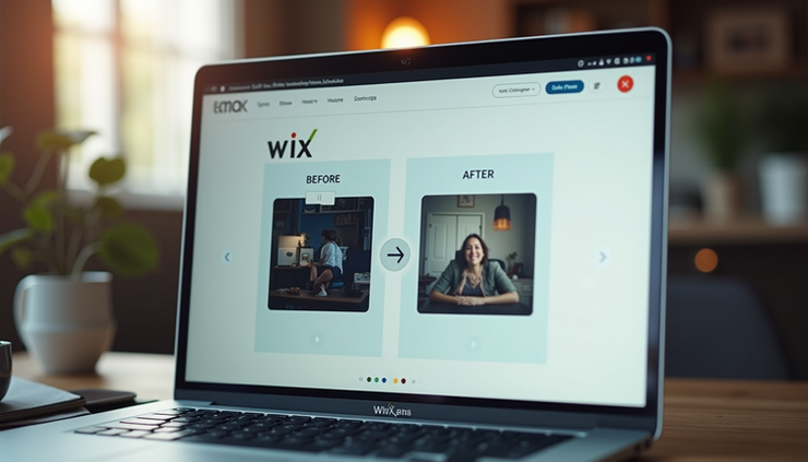
In this tutorial, you will create a toggle button that switches between a plain old Wix site view and a new custom Velo-powered site. The transition will be animated for a smooth user experience. Alongside the toggle, you will include a feature comparison table that clearly lists what changed between the two versions.
This showcase will help your visitors quickly grasp the benefits of your redesign or service improvements, making your pitch more convincing.
✅ Prerequisites
Before you start, make sure you have:
Wix Dev Mode enabled on your site to access Velo features.
Basic knowledge of JavaScript for handling toggle logic.
Screenshots of your before and after versions ready to upload.
Having these ready will make the build process faster and smoother.
📦 Step 1 — Plan Comparison
Start by outlining the key differences between your before and after versions. For example:
| Feature | Before | After |
|-------------------|---------------------------|-------------------------------|
| API Integration | None | Full API support |
| Payment Gateway | Not available | Integrated payment system |
| Chatbot | No chatbot | AI-powered chatbot |
| Admin Dashboard | Static pages only | Dynamic admin portal |
This clear comparison will guide your feature list and help visitors understand the improvements at a glance.
🎨 Step 2 — UI Elements
Create the following UI elements in your Wix Editor:
#beforeBtn: Button to show the before view.
#afterBtn: Button to show the after view.
#beforePanel: Container holding the before screenshot and info.
#afterPanel: Container holding the after screenshot and info.
#featureList: The comparison table or list of features.
#showcaseCard: A card element that wraps the panels and adds border styling.
Arrange these elements clearly on your page for easy interaction.
💻 Step 3 — Toggle Logic
Add this JavaScript code in your Velo backend or page code to handle toggling:
```javascript
$w.onReady(() => {
$w('#beforeBtn').onClick(() => {
$w('#beforePanel').show();
$w('#afterPanel').hide();
$w('#beforeBtn').style.backgroundColor = '#007acc'; // active style
$w('#afterBtn').style.backgroundColor = '#ccc'; // inactive style
});
$w('#afterBtn').onClick(() => {
$w('#afterPanel').show();
$w('#beforePanel').hide();
$w('#afterBtn').style.backgroundColor = '#007acc'; // active style
$w('#beforeBtn').style.backgroundColor = '#ccc'; // inactive style
});
});
```
This code switches the visible panel and updates button styles to reflect the active state.
✨ Step 4 — Smooth Animation
To enhance user experience, add CSS transitions for opacity and transform effects. Insert this CSS in your site's global stylesheet or embed it in a custom code block:
```css
beforePanel, afterPanel {
transition: opacity 0.5s ease, transform 0.5s ease;
}
beforePanel.hidden, afterPanel.hidden {
opacity: 0;
transform: translateX(-20px);
pointer-events: none;
}
showcaseCard {
border: 2px solid #ccc;
transition: border-color 0.3s ease;
}
showcaseCard.active {
border-color: #007acc;
}
```
Modify your toggle logic to add or remove the `.hidden` and `.active` classes accordingly for smooth fading and sliding effects. This subtle animation makes the switch feel natural and polished.
🐛 Common Issues
| Problem | Solution |
|--------------------|-------------------------------------------|
| Panel not switching | Check element IDs match exactly |
| Animation not smooth| Add CSS transition in global CSS |
| Images not loading | Compress images before uploading to Wix |
| Mobile layout broken| Use stack layout for small screen sizes |
These tips help you avoid common pitfalls when building your showcase.
💡 Pro Tips
Use real client screenshots to build credibility.
Add an animated feature counter to highlight key stats.
Embed your showcase in blog posts or case studies for better storytelling.
Link the showcase from your portfolio section to attract leads.
These small touches increase engagement and demonstrate your expertise.
🚀 Conclusion
Building a before and after showcase on Wix with Velo is a powerful way to highlight your work and convert visitors into clients. By combining clear comparisons, smooth toggling, and polished animations, you create a compelling visual story.
Ready to upgrade your Wix site? Visit wixcrafters.com or email wixcrafters@gmail.com to get expert help. Our 5-star Fiverr reviews show we deliver quality every time.
Start building your before and after showcase today and watch your conversions grow.


Comments